If you want to create custom content designs and page layouts for WordPress, the best option for most website owners is to install a page builder plugin. When it comes to choosing one of these plugins, Divi and Elementor are two very popular options.
However, as well as being two of the most well-known and widely used page builders, Divi and Elementor also share similar feature lists, making it difficult to decide which one to choose. On paper, they both look great, but, as is often the case, the small details and differences will dictate which one is best for you.
To help you to pick the right tool, this article compares the features and user experiences of Divi and Elementor, so you can make an informed decision on which one to use for your project.
Let’s begin…
About Divi and Elementor
Installing a page builder plugin such as Divi or Elementor gives you full creative control over how your posts, pages and other types of content look.
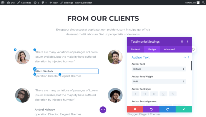
Both Divi (pictured) and Elementor give you a new way to create content in WordPress.
Not only that, but the paid versions of these two plugins allow you to customize the header, footer and other parts of your site outside of the post and page areas.
As Elementor is available in two main varieties — one a free plugin and the other a paid tool with additional features — we’ll be covering both options in this comparison. Because of this, you’ll be able to decide if the free version of Elementor will suffice for your website, or if investing in Divi Builder or Elementor Pro is a better option.
For Divi, we’ll be looking at the standalone Divi Builder plugin from Elegant Themes that’s also available as part of the Divi WordPress theme, also from Elegant Themes.
DIVI AND ELEMENTOR OVERVIEW
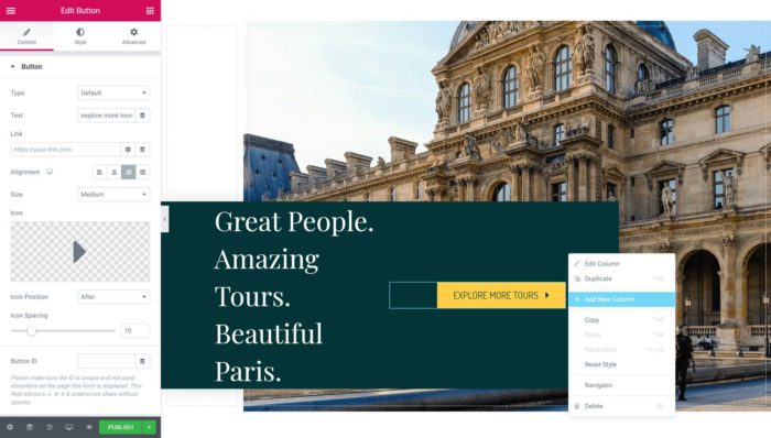
The key features of Divi and Elementor (pictured) are their drag-and-drop visual interfaces.
This guide will look at Divi and Elementor in detail. However, to give you a quick overview of what these tools can do, here’s a list of their key features:
- Libraries of high-quality homepage and inner page templates.
- Powerful drag-and-drop WYSIWYG content editor interfaces.
- Ability to customize all areas of your website, including the header, footer and theme templates.
- Customizable elements for adding a range of content to your pages.
- Ability to create reusable templates and page elements for use throughout your site.
- Role managers to control who can do what with the page builders on your website.
While these page builders may have similar capabilities, their features have been implemented in different ways. Because of this, it’s difficult to evaluate and compare them simply by looking at their feature lists.
However, by the time you’ve finished reading this comparison, you’ll know whether Divi or Elementor is the right page builder for your website.
Before we get to the in-depth exploration and comparison of their features and user experiences, here’s the key information about each plugin.
ABOUT DIVI
The Divi Builder started life as a content editor integrated into the Divi WordPress theme. Now, though, that page builder is also available as a standalone WordPress plugin for use with any WordPress theme, and it’s the product we’re looking at for this comparison.
The Divi Builder is available as a standalone WordPress plugin, or as part of the Divi theme.
While the page builder is now available as a plugin, if you’re yet to choose a theme for your WordPress website, and you like the sound of Divi Builder, you could kill two birds with one stone and install the Divi theme to apply a high-quality theme to your WordPress website and also gain access to the page builder.
We’ll cover the pricing details in more depth later in this page builder comparison, but both the Divi Builder plugin and Divi WordPress theme are available from Elegant Themes in a single package that starts at $89.
ABOUT ELEMENTOR
As mentioned, you can start using the Elementor page builder for free, or pay for Elementor Pro to access a more feature-rich version of the tool.
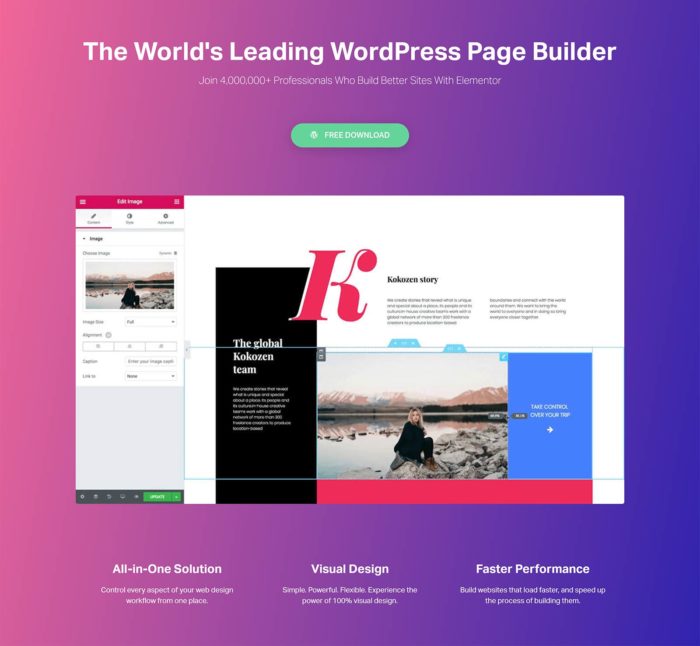
Elementor is available as a free version and a more feature-rich premium version known as Elementor Pro.
While installing either plugin gives you access to the same page builder interface, Elementor Pro includes more templates and modules, plus a few additional features to help you to customize all of your WordPress website, create pop-ups, and integrate with lots of third-party services. There’s also a free theme for Elementor that can be used if you’ve yet to choose one for your website.
You can read a breakdown of the differences between Elementor Pro and the free version on the Elementor website.
Divi vs Elementor Features Compared
Both plugins aim to solve the same problem — making it easy to create a custom WordPress website — and therefore they share similar feature lists. So, to help you to decide which one to choose, here’s a comparison of their key features.
EDITABLE CONTENT TEMPLATES
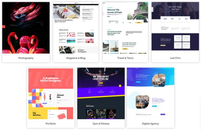
Both Elementor (pictured above) and Divi come with hundreds of high-quality editable templates.
While it’s great that both plugins let you create your own custom page designs from scratch, doing so can be time-consuming, not to mention quite difficult, if your design abilities aren’t up to much.
Thankfully, Divi and Elementor Pro, and, to a lesser extent, the free version of Elementor, are packed with high-quality templates. You can use the templates as they come and just make a few edits to their text and images, or completely customize them so they become unique designs.
Some examples of the types of templates you get access to with both plugins include:
- corporate and business-focused website templates
- marketing, design and SEO agency templates
- many different ecommerce store templates
- lots of service provider and freelancer templates
- online portfolio templates
- blog templates, covering food, travel and health topics
- multiple sales-focused landing page templates.
As you can see, whatever type of website you’re planning, or piece of content you need to create, you’ll probably find a template that’s ready to go.

An example of one of the editable Divi layouts.
If not, there should be one that’s a close match that you can adjust to meet your requirements.
When it comes to the number of templates you get access to with each of these page builder plugins, Elementor Pro has an impressive 150-plus templates, while Divi takes things even further with more than 1,100 layouts. The free version of Elementor only has around 40 templates, but you may find the one you need among this smaller selection.
However, while it’s easy to focus on the numbers, it’s worth mentioning that it’s best to choose the plugin with the most templates that are right for your project, rather than the one with the most options overall.
TEMPLATE ORGANIZATION
To help make its constantly expanding template library more manageable, the Divi layouts are organized into website packs. Each pack typically includes a homepage template, as well as layouts for adding other content to your site, such as the about, contact and landing pages, as well as blog posts and portfolios.
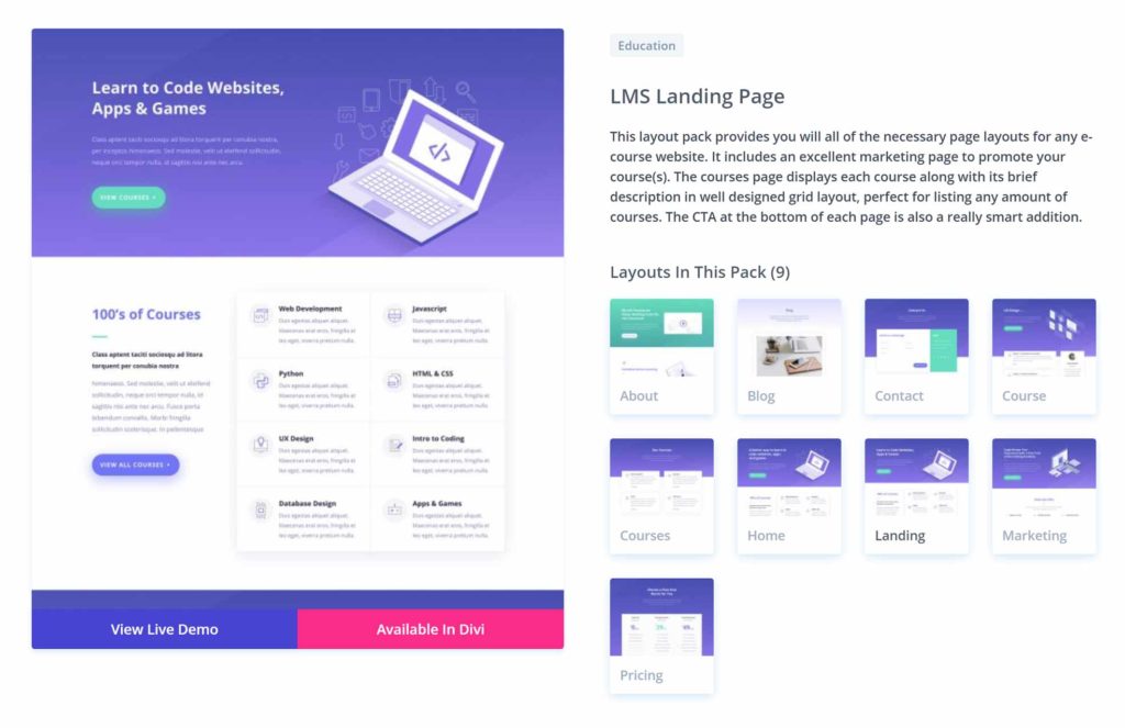
The Divi templates are organized into packs that contain multiple layouts for creating a specific type of website.
The Divi layout packs are useful, as they provide you with most, if not all, of the templates you’ll need to launch your site. However, you’re free to mix and match the templates from the different packs to create your own custom site.
With Elementor, the templates aren’t as clearly organized into website packs, making browsing the library less convenient than it is with Divi. However, there are a few sets of templates that have all been designed for the same purpose, such as a series of layouts for creating a digital agency website or an online portfolio.
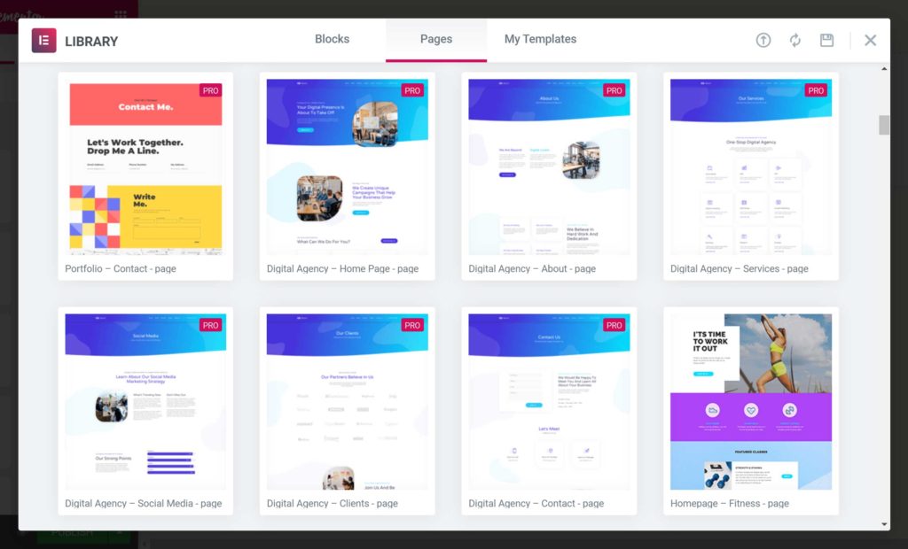
Both plugins make it easy to import their templates into your posts and pages.
With both plugins, importing the templates is very straightforward, enabling you to quickly lay the foundation for your new site or add extra pages to your existing site.
CONTENT TEMPLATES SUMMARY

An example of one of the editable Elementor Pro templates.
Regardless of whether you choose Divi or Elementor Pro, you’ll get access to lots of high-quality templates for creating all types of websites and adding individual pieces of content to your site.
Thanks to Divi’s website pack system, it’s easier to quickly find and import a collection of templates that have all been designed for the same project.
With Elementor, there are a few website packs, or kits as they call them. However, most of the Elementor templates are individual layouts designed for adding a single page to your site, rather than building an entire website.
While you get a good amount of templates with both plugins, the best way to decide which page builder is right for you in this regard is to browse their libraries (view the Divi and Elementor libraries) and see which are more relevant for the type of website you’ll be creating.
PAGE BUILDER FEATURES
We’re just about to look at the page builder interfaces of Divi and Elementor to demonstrate the content creation process and user experience of both plugins.
However, before we explore how they work, here’s a quick rundown of some of the best features of the Divi and Elementor page builder interfaces:
- Ability to drag and drop elements around the page.
- Ability to undo and redo actions and view the page editing history.
- Ability to heavily customize any of the elements that make up your page.
- Ability to preview page designs in a range of viewports, including smartphone and tablet views.
- Ability to create reusable content elements that you can quickly insert into multiple pages.
As the list of features above shows, you can do a lot more with these tools than you can with the standard WordPress editor.
Now, let’s take a look at what it’s like to use these plugins to build a custom page design for your WordPress website.
PAGE BUILDER INTERFACES
As mentioned, both Elementor and Divi add a new interface to your WordPress website that you can use to create custom designs and layouts for your posts, pages and other content.
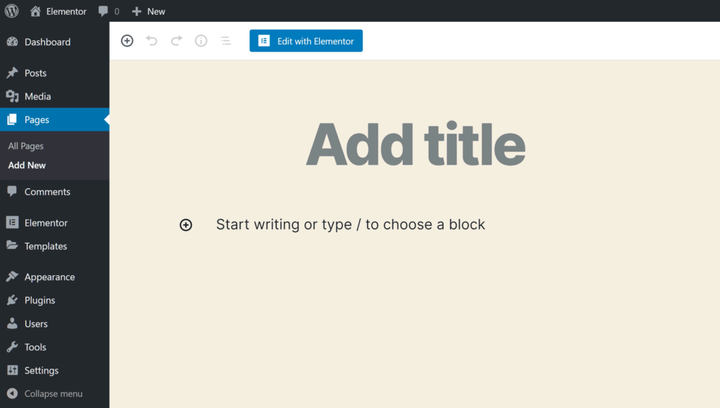
Both plugins add a button to the WordPress editor that lets you use their page builders to create content.
Once you click on the button to launch the page builder, you can start using the drag-and-drop interfaces of Divi and Elementor to do much more than you can with the default WordPress editor.
These page builders replace the default WordPress editor with a custom content editing user interface.
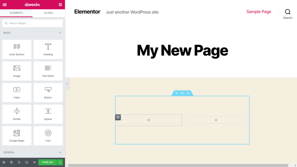
When it comes to creating a custom page design, both plugins use row and column-based structures to enable you to build your layout. Each page can have multiple rows, and each row can include multiple columns, giving you lots of freedom when building your pages.
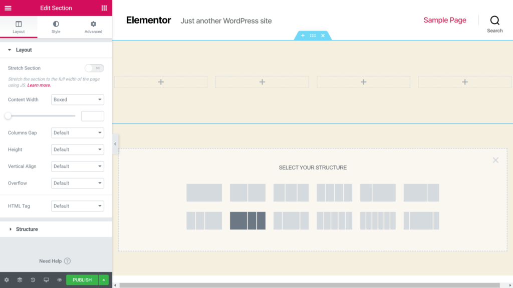
Both Elementor (pictured) and Divi use rows and columns to build the page layout structures.
As both plugins include a good selection of pre-defined column layouts, you can quickly start building the structure of your page.
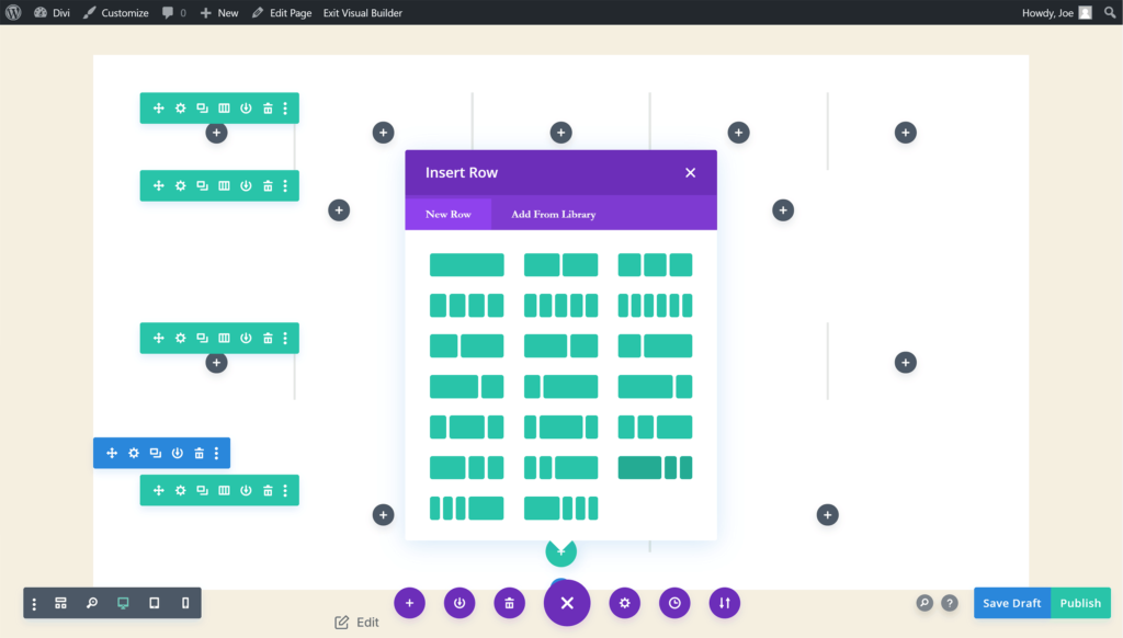
Divi does have a few more pre-defined column layouts to choose from when adding a new row to your pages.
If you want to adjust the column distribution, you can do so easily with Elementor by simply dragging the column border to increase or decrease its width.
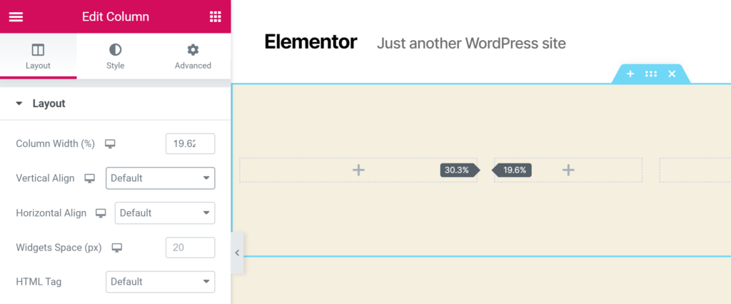
Unlike Divi, Elementor (pictured) lets you drag the column borders to give you full control over the width of your columns.
While you can’t drag the column borders to resize them in Divi, you can switch the pre-set column structure of a row that’s already been added to your page, changing it to a different column distribution. This does limit your options slightly, but you should be able to find a pre-defined layout that’s a match, or at least very close, to your requirements.
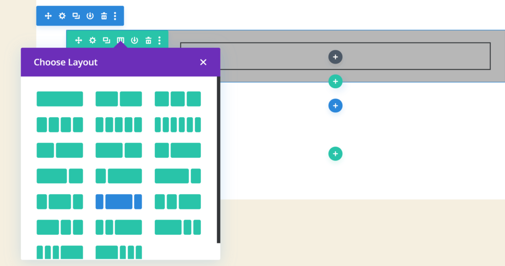
Divi lets you change the column structure of rows you’ve already added to your page.
Due to the row and column-based structure, you’re not able to position your page elements anywhere you like, such as on top of each other or with slightly overlapping edges, as you can with a non-WordPress page builder tool, such as Instapage.
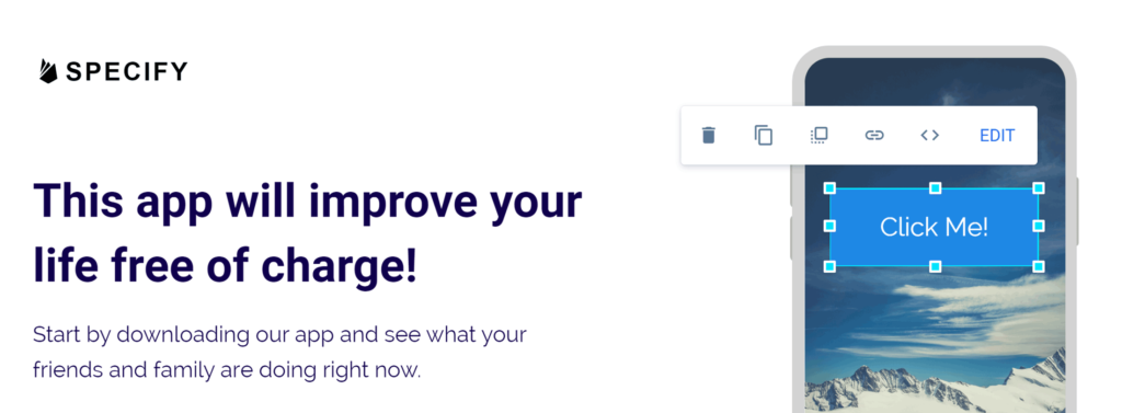
The non-WordPress, hosted landing page builder, Instapage, lets you stack items on top of each other, unlike the Divi and Elementor page builders.
Instead, with Divi and Elementor, your page content must work within the boundaries of the row and column structure you’ve created. For some readers, though, having the structure of a row and column-based layout to follow will be preferable to the total freedom of a tool such as Instapage.
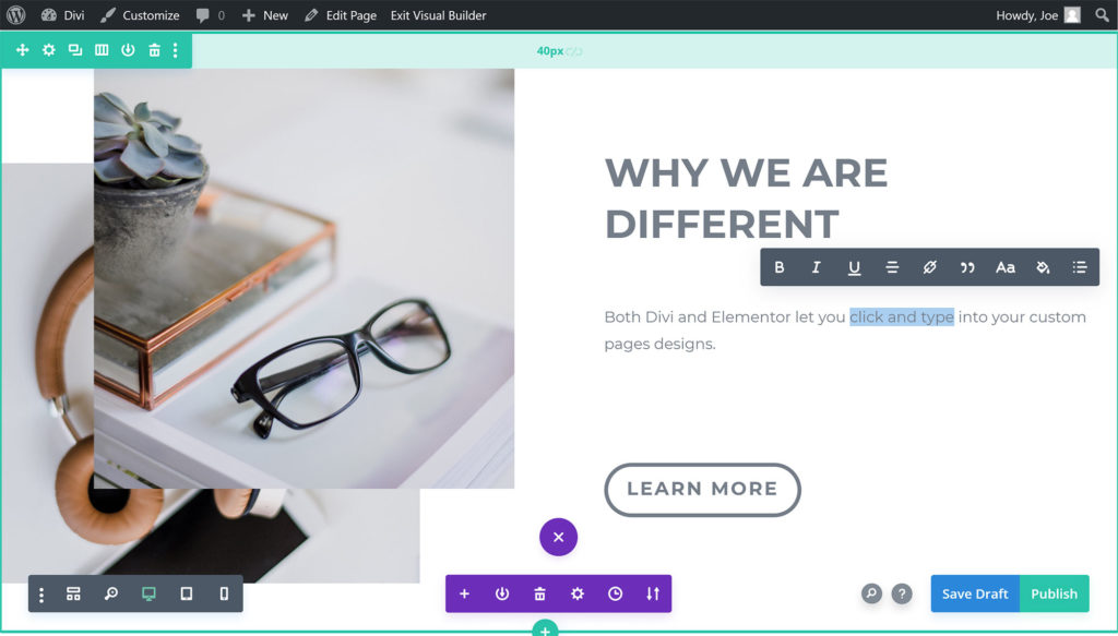
The Divi Builder interface is very different from the standard WordPress editor interface.
However, that being said, whether you choose Divi or Elementor, you still have a lot of creative freedom when designing your pages.
For example, both plugins give you full control over the appearance of your columns and rows, including the colors, borders, background displays and alignment. Like the other elements you can add to your pages with Divi and Elementor, you can also apply animation effects to your rows, such as slide-in or fade-in effects.
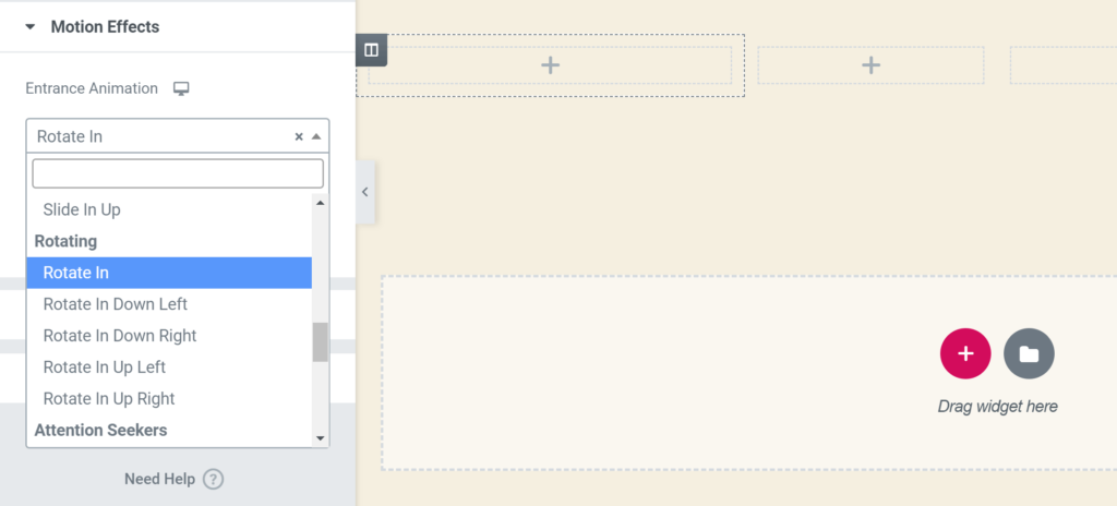
As well as applying animation and motion effects to your page elements, both plugins let you customize the appearance of the row columns and cells.
Once you’ve added one or more rows to your page, you can then start inserting the elements into your layouts to continue building your custom content design.
PAGE BUILDER INTERFACE SUMMARY
The user interfaces of both Divi and Elementor have come a long way since the early days of page builder plugins, and they’re also a significant departure from the standard WordPress content editing experience.
Because of this, getting the most out of either tool will require a period of learning and adjustment. Even those who are experienced WordPress users, but aren’t familiar with its modern page builder plugins, probably won’t be able to do exactly what they want with these tools right away.
However, with a bit of persistence and some trial and error, you should be able to create the kind of content designs that just aren’t possible with the default WordPress editor.
One useful feature that Divi has and Elementor doesn’t is its wireframe mode. Switching to this view in the page builder hides the content of the page, revealing the underlying structure. This makes it easier to see how the page was built and which modules it contains. Elementor does have a similar Navigator feature, but it’s not quite as helpful.
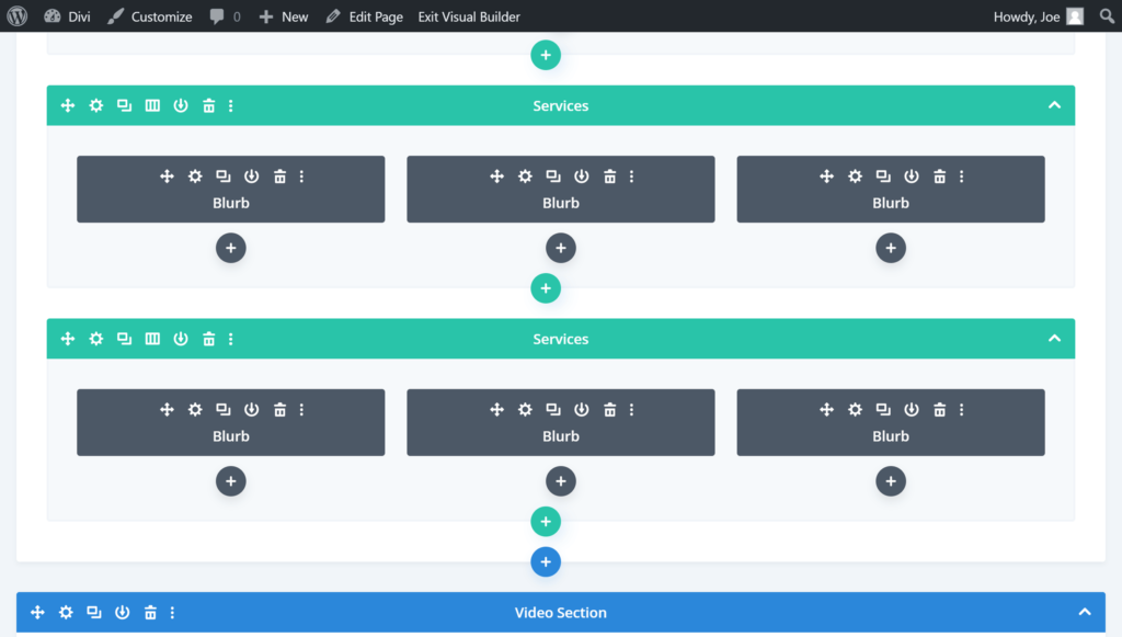
Unlike Elementor, Divi gives you the option of switching to wireframe mode to get a clearer view of the page structure.
Out of the two tools, Elementor is probably easier to use. Its user interface isn’t quite as unique as Divi’s, and therefore it has less of a learning curve.
WIDGETS AND MODULES
To help you to create effective pages for your website, both plugins include impressive selections of widgets and modules that you can insert into your layouts via the page builder interfaces.
With the free version of Elementor, you get access to 30 basic widgets, while the pro version of the plugin includes more than 40 additional advanced widgets. Divi users can add 40 modules to their pages.
The modules and widgets of both plugins are all highly customizable too, so you get full control over how they look once they’ve been added to your pages.
Some examples of these modules:
- Buttons and calls-to-action
- Price tables
- Testimonial carousels
- Blog post lists
- Portfolio content grids
- Countdown timers
- Video players
There’s a lot of crossover when it comes to the modules you get access to with both of these tools, and any that are in one plugin but aren’t in the other shouldn’t be deal-breakers, such as the flip boxes of Elementor that aren’t in Divi or the filterable portfolio option of Divi that isn’t in Elementor.
When it comes to whether Divi or Elementor has a better selection of modules, it’s hard to declare one a winner. Elementor Pro has more than Divi, but it really depends on which elements you want to add to your pages.
WORDPRESS THEME OPTIONS
Both plugins should work with any themes that ‘respect the coding standards of WordPress set by its Codex’, but if you’ve yet to start your website and choose a theme, or if you’re looking for a new one for your site, Divi and Elementor both have their own themes.
As mentioned earlier, as well as the Divi page builder plugin, there’s also a Divi WordPress theme. The pricing section of this comparison includes all of the details about purchasing these tools — however, when you buy the Divi plugin, you also get access to the Divi theme. Therefore, if you’re creating a new WordPress website, you won’t have to worry about finding a suitable theme if you decide Divi is the best page builder for your project.

Purchases of the Divi Builder plugin come with the Divi and Extra WordPress themes, while the Elementor team have created a free theme for use with their page builder.
The Elementor team have produced a free theme called Hello Elementor that they describe as being ‘a plain-vanilla & lightweight theme’ for their page builder. There’s also a list of recommended free and premium third-party themes on the Elementor website.
Because of this, you don’t have to worry about finding a suitable theme with either Elementor or Divi, as they both provide you with a compatible option.
THEME BUILDERS
Typically, most page builder plugins only let you work on the post or page content, rather than the parts of your site that are defined by your theme, such as the header and footer areas, or the single blog post and blog archive templates.
However, after recent updates, both the Divi and Elementor Pro plugins now have a feature they describe as a Theme Builder.
What this means is that you can design custom headers and footers for your website, either starting from scratch or using their templates, and then assign that custom header or footer to all of your site, or to specific parts of it.
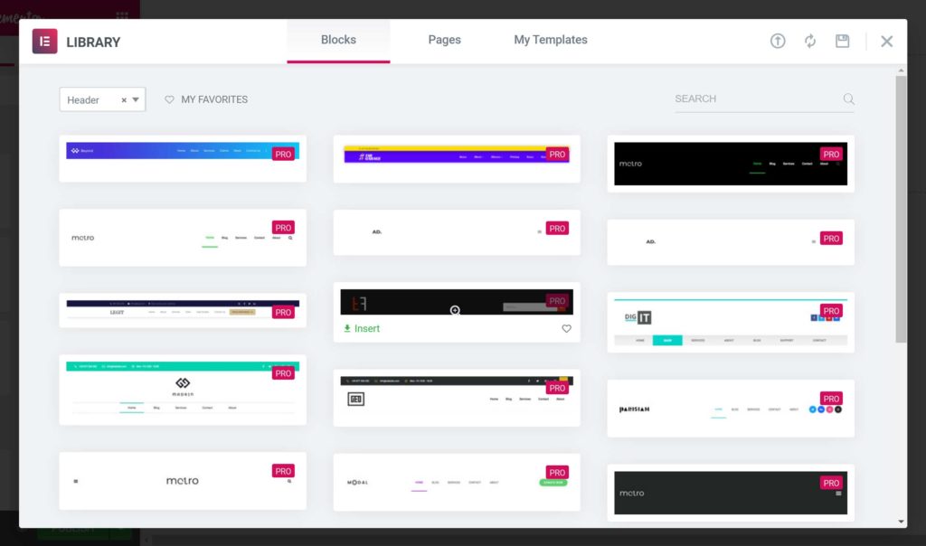
Elementor Pro has lots of header, footer and other templates for use with the Theme Builder feature.
With Elementor, creating the custom header area takes place in the page builder interface, giving you full control over how this area of your site looks, regardless of which theme you’re using.
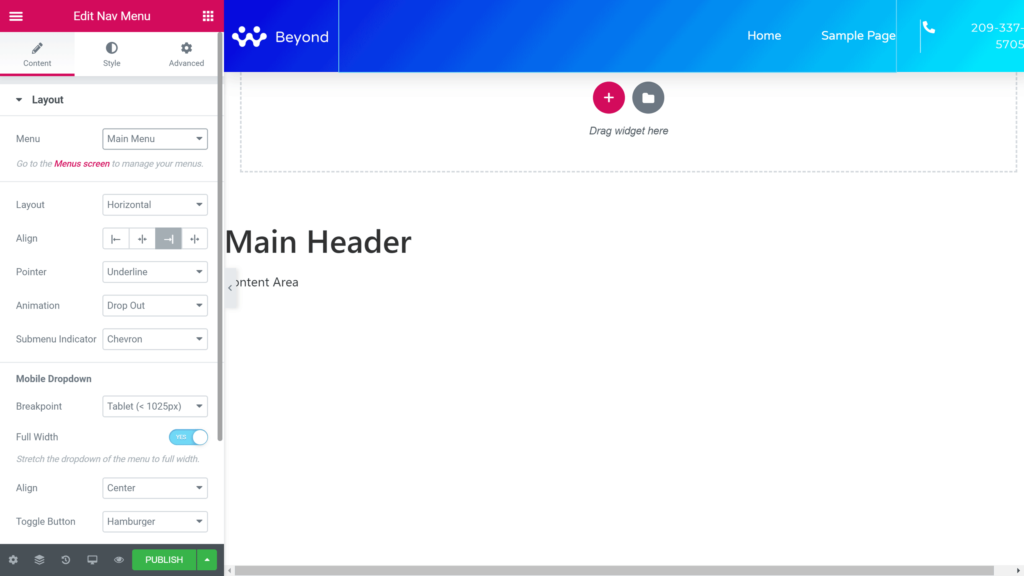
You can create the custom header and other theme elements in the Elementor page builder.
Dynamic content, such as the site logo and the menu to display in the custom header, can all be defined through the Elementor page builder interface.
The Divi Theme Builder works in much the same way as the Elementor Theme Builder, giving you control over all aspects of your WordPress website.
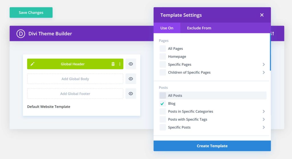
As with Elementor Pro, the Divi Theme Builder (pictured) lets you design custom theme templates through its editor, then control exactly when they’re used on your site.
Features such as the conditional publishing settings of both tools make it easy to automatically assign templates, such as a custom single post layout, to content from specific categories, for example.
If you want to design custom headers, footers, blog post templates and more, both Divi and Elementor Pro make it possible with their theme builder features. Both plugins have implemented this feature really well.
ADDITIONAL FEATURES
As well as having all of the essential features that make a great page builder plugin, such as a large set of high-quality templates and a powerful visual editor, Divi and Elementor have a few other features that are worth quickly mentioning.
DIVI LEADS
To take the guesswork out of creating custom page designs that convert against your website goals, such as encouraging your visitors to get in touch via a contact form, join your email list, buy a product or take some other action, Divi has a tool that can help you to optimize your content.
That tool is Divi Leads, and it’s integrated into the page builder, allowing you to run split tests by creating multiple versions of a page element, such as a button or headline. Divi Leads will then show the different versions of that element to subsets of your audience.
While the test is running, the audience interactions with the different versions of the elements are tracked, enabling you to clearly see which one delivers the best results against your goals. Once you’ve created the variants of your page that you want to test, the whole process of running the experiment and collecting data is very hands-off.
While you may think your custom page designs look great, Divi Leads can tell you if they’re actually effective at helping you to convert against your goals.
Although Elementor doesn’t have a split-testing feature, it can be integrated with Google Optimize, giving you a way to run A/B testing on your custom content. However, having this functionality integrated into your page builder, as is the case with Divi, does make optimizing your custom designs easier and more efficient.
ELEMENTOR POP-UPS
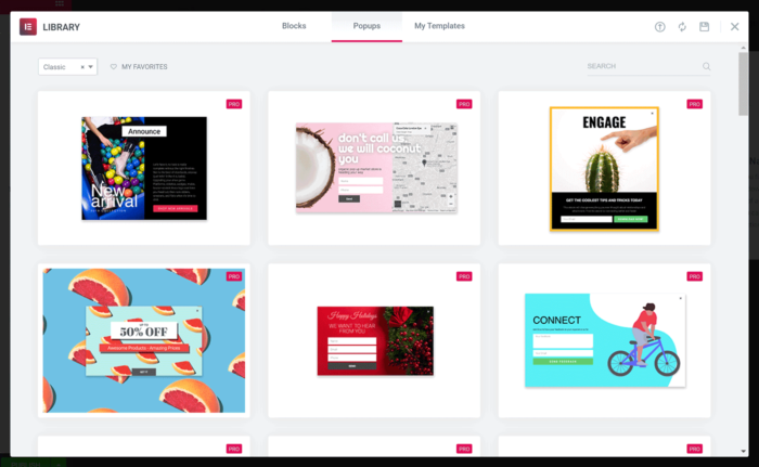
Elementor Pro has a pop-up builder feature with its own set of templates that you may find useful.
A feature that Elementor Pro has that Divi (and the free version of Elementor) doesn’t is a pop-up builder that lets you create your own eye-catching pop-ups, fly-ins, hello bars, full-screen displays and more — all through the Elementor page builder interface.
If you want your visitors to perform a specific action on your website, or view an announcement, pop-ups and their variants are a great way to grab their attention.
While Divi doesn’t have a built-in pop-up creation feature, purchasing Divi does give you access to the pop-up and email optin plugin, Bloom, a useful tool we’ve reviewed in the past. However, once again, having the functionality integrated directly into the page builder plugin, as is the case with Elementor, is more convenient than using a separate tool.
COMMUNITY
Elegant Themes has done a great job of fostering a community around its products, including the Divi Builder plugin. Its website has one of the busiest blogs about WordPress, with lots of useful content for Divi users.
Furthermore, there are also in-person meetups held all around the world, where you can connect with other Divi users. The official Divi Facebook group, as well as the many unofficial ones, gives you another place to get support and inspiration for your projects.
The Elementor community also includes in-person meetups, busy Facebook groups, and a place for developers to collaborate on the plugin.
ADD-ONS AND UPGRADE OPTIONS
As both Divi and Elementor are very popular page builders, a number of third-party add-ons have been created for these plugins. Some are free add-ons while others are paid extensions. However, if you discover that there’s something you can’t do with either Divi or Elementor, there’s a good chance you’ll be able to find an add-on that brings this functionality to the page builders.
Where to find add-ons for Elementor and Divi:
- Elegant Marketplace lists free and paid add-ons from a range of sources.
- Elementor add-ons page includes links to free and paid options.
If you can’t find an add-on that addresses your issue, it’s possible you could code one yourself or hire a developer to build it for you. In fact, there’s a lot of information for developers who’d like to create solutions for their page builder on the Elementor website.
PRICING OPTIONS
Here’s a quick overview of the pricing options for these plugins before we break down exactly what you get for your money:
- Divi Builder: $89 for a one-year license or $249 for a lifetime license, with both options providing you with access to additional plugins and themes from Elegant Themes.
- Elementor: Free version available, while the Elementor Pro licenses start at $49 a year.
As you can see, the Divi Builder plugin comes with the other products from Elegant Themes, so, when you purchase Divi Builder, you also get access to the Monarch social sharing plugin. Both license options include access to the same sets of features of Divi Builder and the other products from Elegant Themes.
Divi Builder is available on two pricing plans.

Regardless of whether you choose the one year or the lifetime license, you can use the Elegant Themes products on an unlimited number of websites.
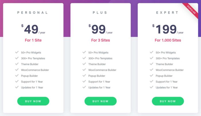
The price of Elementor Pro depends on how many sites you want to use the plugin on.
With Elementor Pro, the $49 license allows usage on a single website, with the more expensive options covering greater numbers of sites. Other than that, the Elementor Pro licenses are the same, giving you access to all of the features of this plugin, regardless of which option you choose.
Both Divi Builder and Elementor Pro have 30-day money-back guarantees, so you can try them risk-free.
Final Thoughts
Both Divi Builder and Elementor Pro are exciting and impressive content editors for WordPress. Not only do they give you full control over your posts and pages, but also the headers, footers and other areas of your website. The creative potential for your site with either tool is almost unlimited.
Regardless of which one you choose, you won’t be disappointed.
However, to help you to make a decision, check out their templates to see which plugin has more options that you’re likely to actually use.
Viewing the selection of modules is a good idea, too, just in case there’s a particular element that you want to add to your site that isn’t included in Divi or Elementor.
When it comes to ease of use, the Elementor interface is probably the easier of the two to get started with. So, if you don’t have the time or inclination to learn a totally new system, Elementor may be better for you than Divi with its unique user interface.
